
The Keep List: Design systems that scale
Foundational backbone to any product—and free tools to start building yours

Welcome to The Keep List
A recurring collection of five things worth keeping—tools, ideas, and habits that make work, creativity, and life flow better.
This is the first official volume of my Friday column series for fellow design lovers. If you’ve been following along on my other publication, you might’ve read my first piece on the joys that don’t cost a thing.
Today’s keep list is for the builders, tinkerers, and system-minded among us.
Systems
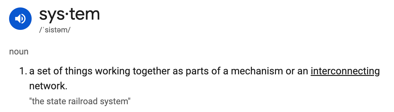
What does that word trigger for you?
For me, it’s unity, alignment, and ease. A sense that things are connected and intentional—there are written or social rules to guide us. But too much system? Well, we all know how that feels in real life. No, thank you.


The first image that comes to mind is Japan—specifically the Tokyo train system. Intricate, vast, yet incredibly efficient. It’s one of the most complex networks in the world, and somehow, it works beautifully. (Funny enough, the Oxford Dictionary’s example for “system” also mentions railroads.)
A design system is much the same. It’s the backbone of any product or idea—the foundation you return to, with room to grow and evolve.
But documenting a design system? That’s another story.
Major companies have entire teams dedicated to refining, scaling, and governing their design systems.
My own role in building, maintaining, and managing ours didn’t come easily. We have over 30 mature products and, when I started, essentially no unified design system. It took nearly two years to align and retroactively sync everything—painful, but necessary.
When I eventually get the chance to build a design system from scratch, these are the notes I’ll return to.
When you look at the strongest design systems out there, a few core foundations always show up.
01/ Strong tokens & variables system
Tokens and variables translate foundational design decisions into reusable, flexible systems. They power multi-brand scalability and make developer handoff seamless. One small change can cascade consistently across the entire product suite.
Tokens are not just design decisions—they’re the shared language between design and development.
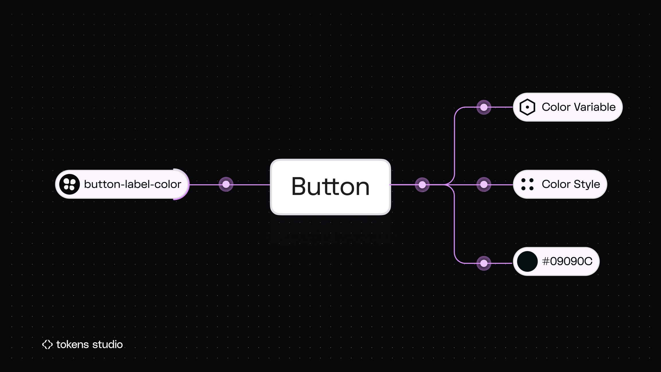
Updating a single primary/blue-500 token, for example, can instantly sync styles across 20+ product interfaces.
Color is often underestimated, but it’s one of the most powerful applications of tokens. Building an efficient color system involves understanding gradients and hues, and organizing them into primitive and semantic tokens. We used this approach to create 1:1 color pairs for light and dark modes—a process that was tedious to set up but crucial for scalability. Figma’s variables and theming features made it seamless to apply and switch between modes once the foundation was in place.
Free resources
A few helpful tools and intros if you’re exploring tokens and variables:
Introduction to Design Systems — A great free foundational course (6 chapters)
Tokens Studio Plugin — Our go-to tool for managing design tokens
Tokens, Variables, and Styles — YouTube walkthrough on design tokens in action
Tokens Studio for Figma — Written guides by Tokens Studio
Figma Tutorial: Use Figma Variables Like a Pro — Video + practice file to get hands-on
02/ Reusable components & variants: the core of scalability
A strong design system must evolve—supporting countless screens, flows, and features while scaling seamlessly across teams, products, and even acquisitions. It will never be “one size fits all.” Instead, it should grow and adapt as technology advances and user expectations change.
Reusable components and well-structured variants form the foundation of that growth. By designing modular building blocks—components, patterns, and tokens—teams can extend the system without breaking existing experiences. This approach anticipates new features, platforms, and product lines, making it easy to adapt instead of rebuild.

Design components to be modular, adaptable, and composable. Use variants and properties to account for different states, contexts, and use cases without duplicating work.
This ensures scalability, reduces redesign effort, and maintains consistency across markets and technologies—allowing teams to ship faster with confidence.
Free Figma resources
Create components to reuse in designs — How to build reusable components
Create and use variants — Guide to grouping related components into variant sets
Guide to components in Figma — Overview of component fundamentals
Creating and organizing variants — Tips for layout, naming, nesting, library structure, and variant description
03/ Document as you build
Oh, the power of clear, concise documentation. It’s often one of the most time-consuming parts of building a design system—but also the most impactful. Documentation is what makes your work tangible and understandable to every department, from engineering to marketing. Without it, even the best-designed systems become underused or misapplied.
The key is to document as you build, not after. Treat documentation as part of the design process, adding notes, naming conventions, and usage guidelines directly in Figma or Notion while components are being created. This builds shared understanding early and prevents confusion down the road.
Good documentation doesn’t just explain what a component is—it also clarifies why it exists, when to use it, how it behaves, and common do’s and don’ts. Real examples, edge cases, and visual guidelines turn documentation from a reference into a tool teams rely on.
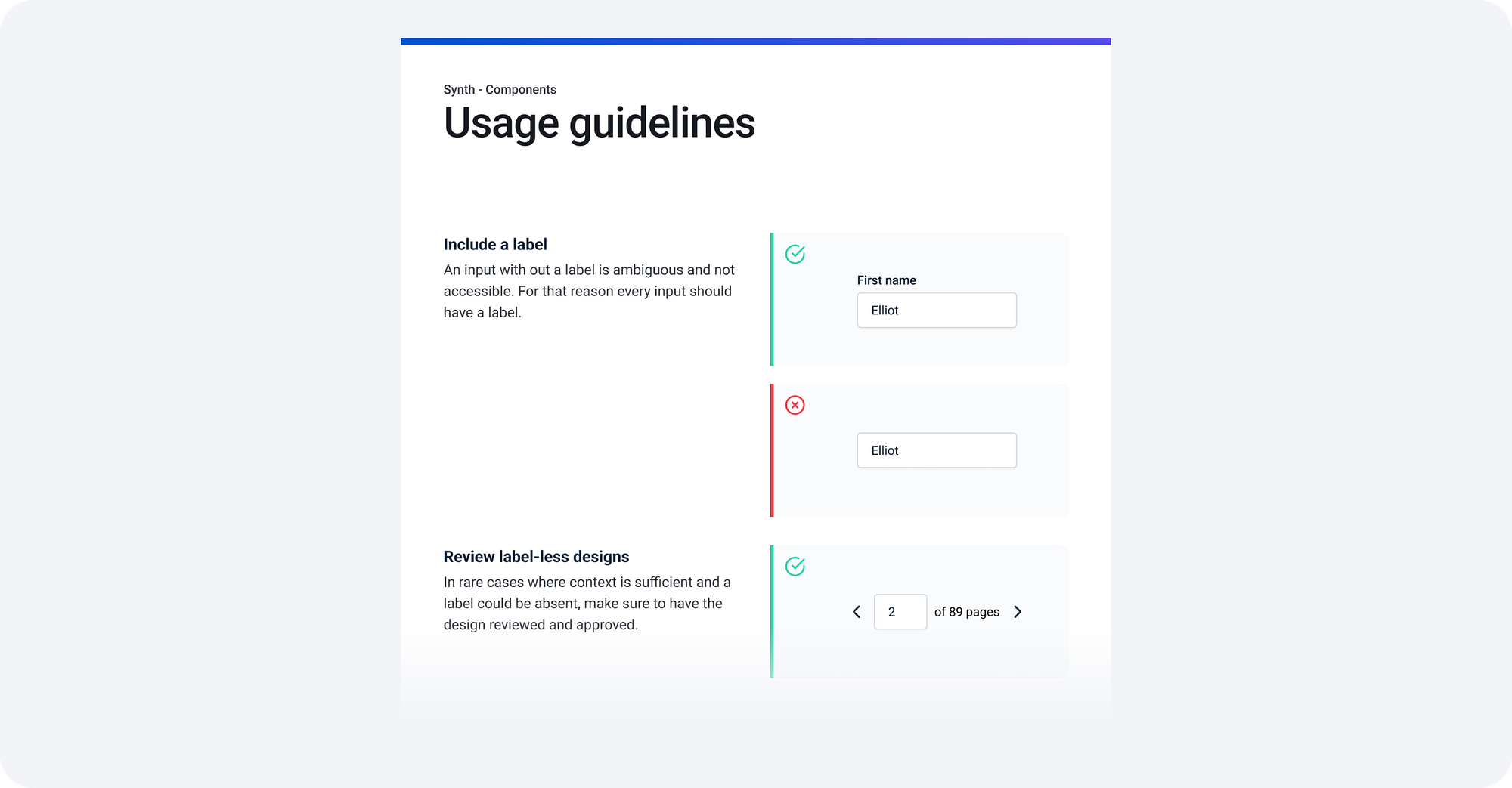
The payoff is huge: fewer questions later, smoother onboarding, and more consistent experiences across every product and platform.
My favorite design systems
04/ Version & release control
A design system is a living product. As components evolve, features are added, and decisions shift, versioning becomes essential. Choosing a versioning system and sticking to it ensures everyone—from designers to developers—knows what changed, when, and why.
It’s easy to overlook small updates, but skipping documentation often catches up later when context is lost. Maintaining version history, changelogs, and decision logs is just as important as the design work itself.
A common approach is Semantic Versioning, which breaks changes into three levels:
MAJOR— Incompatible changes that might break existing usageMINOR— Backwards-compatible feature additionsPATCH— Backwards-compatible bug fixes or small improvements

Beyond version numbers, strong governance includes defining release cycles, documenting decisions, and outlining deprecation paths. These practices keep the system organized, traceable, and easy to scale as it grows.
Articles
05/ Design → Dev pipeline integration
A design system only works if it’s usable by engineering. The bridge between design and development isn’t optional—it’s where the system proves its value.
Integrating directly into the development workflow ensures that components, tokens, and patterns translate seamlessly into production. Whether that’s through Storybook, code snippets, auto-syncing tokens, or shared component libraries, the goal is to make adoption effortless.
When design and dev speak the same language, handoff becomes collaboration instead of translation. It reduces implementation errors, speeds up release cycles, and keeps the product experience consistent from concept to code.
Design systems are never just about components—they’re about communication. From tokens to release notes, the goal is clarity that scales.
Free resources
Storybook (I love this) — Build, test & document components
Figma dev mode — Inspect designs and translate them into code
What’s on your Keep List this month? Reply or leave a comment—I’d love to hear yours.
Thanks for reading The Keep List. From my desk to yours—see you next time.
—Janice Fong x